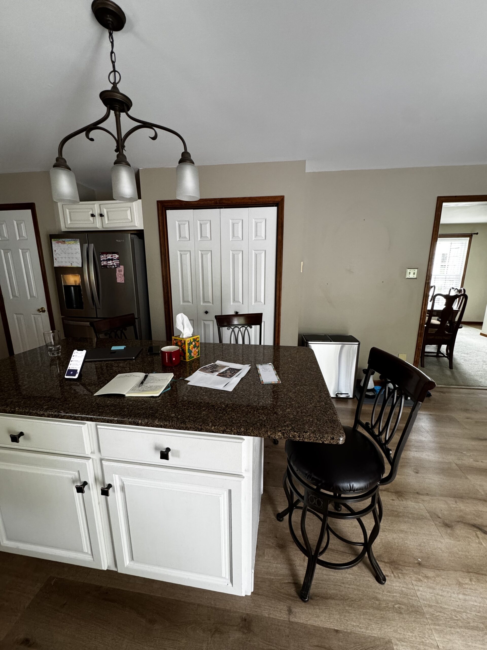
This kitchen wasn’t supposed to be a “right now” project. But the moment I walked in, it was clear—the issue wasn’t just how it looked. It was how it worked.
The layout felt chopped up. Storage was there, but not where it needed to be. The island was undersized. The wall with the pantries felt disconnected from the rest of the space. And the lighting? One central fixture trying to do everything and not really doing much.
At that point, the kitchen wasn’t even on their immediate priority list. But sometimes the biggest opportunity in a home is the one hiding in plain sight.
The Real Challenge Wasn’t Style – It Was Alignment
They didn’t walk in with one clear vision.
They walked in with two.
He wanted a kitchen that felt like a chef’s space – functional, grounded, a little more traditional.
She wanted something lighter, cleaner, more modern.
At first glance, those directions don’t always play nicely together.
But the goal isn’t to pick one over the other.
The goal is to design a space where both feel intentional.
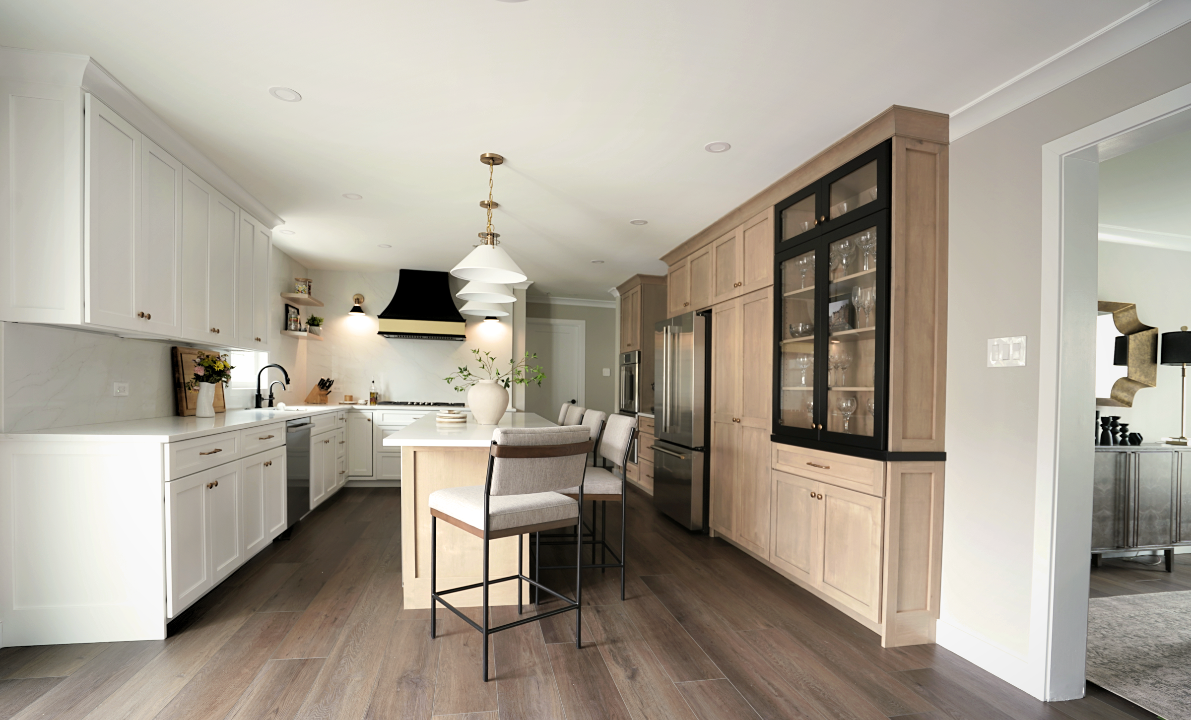
Reworking the Layout: Where Everything Changed
Before thinking about finishes, the layout had to make sense.
- The awkward pantry wall was rethought entirely to create a continuous, functional run of cabinetry
- Upper cabinets were extended to the ceiling to add height and eliminate visual breaks
- The island was expanded significantly to improve both prep space and seating
- Storage was reorganized so it actually supports how the kitchen is used daily
These weren’t cosmetic changes. They’re the kind of decisions that determine whether a kitchen works – or constantly frustrates.
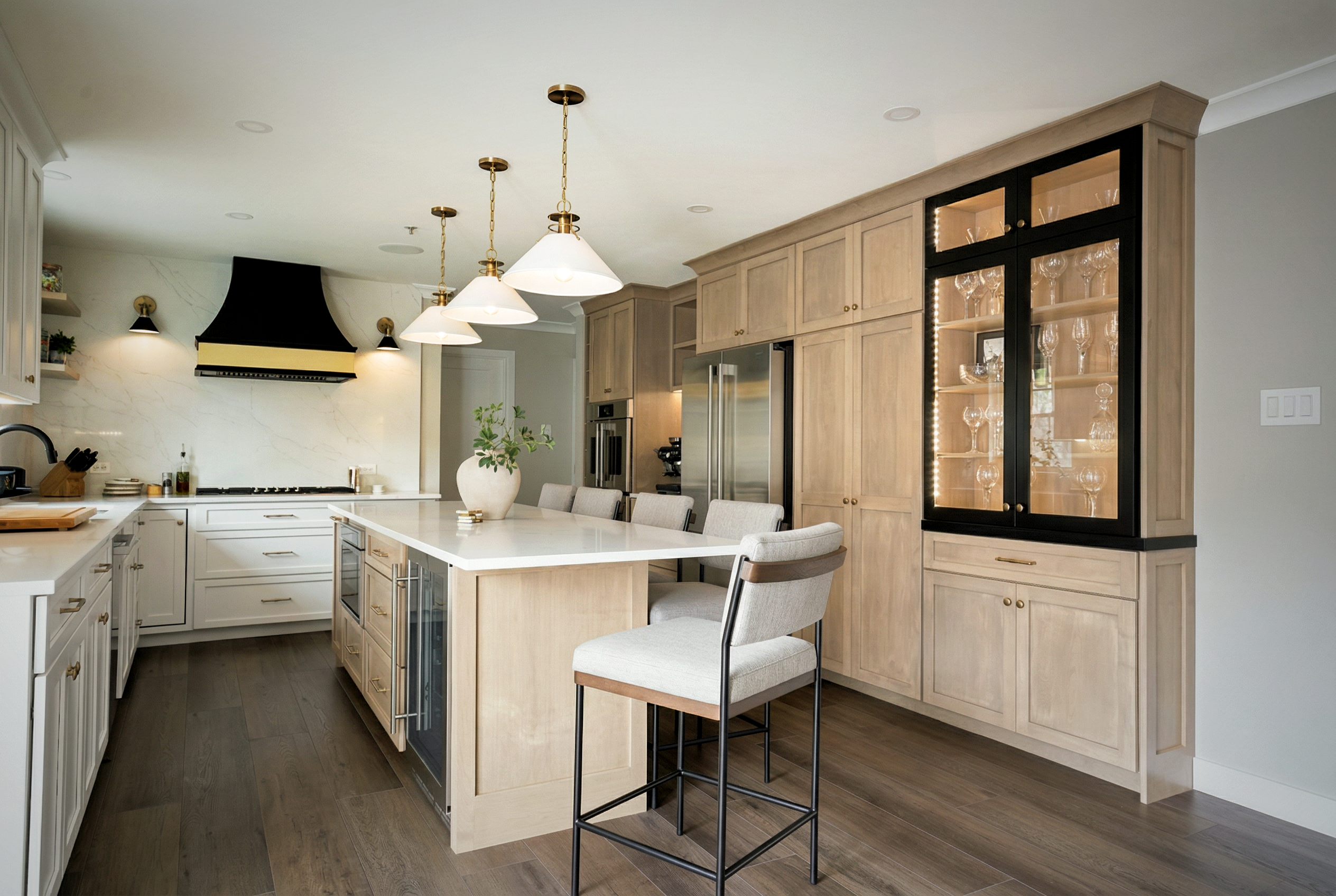
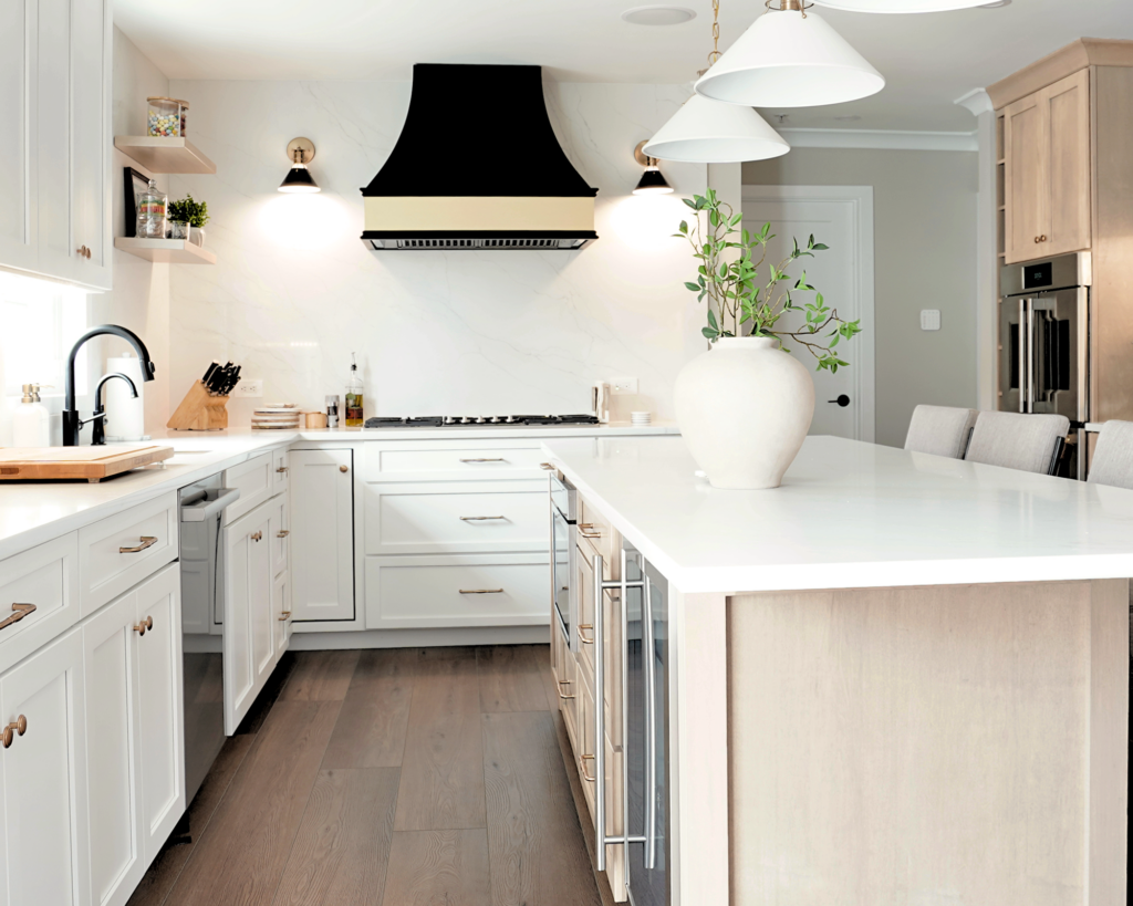
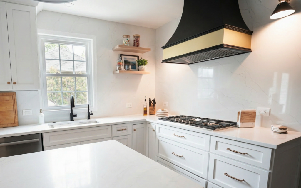
Balancing Wood and White
Once the structure was right, the materials could do their job.
- White cabinetry keeps the space light and clean
- Warm wood adds depth and a sense of grounding
- Black accents bring structure and contrast
Individually, these elements are common.
Together, they create balance.
Nothing feels out of place because nothing is competing.
The Details That Quietly Do the Work
Some of the most important upgrades aren’t the ones that immediately stand out.
- A full quartz backsplash simplifies the palette and adds continuity
- Layered lighting replaces a single fixture: recessed, task, decorative, and integrated cabinet lighting
- The custom hood becomes a focal point while still tying into the overall composition
- The black cabinet introduces contrast without overwhelming the space
These are the decisions that make a kitchen feel finished – not just updated.
Why This Kitchen Works
It’s not because of one feature.
It’s because everything is working together.
The layout supports how they live.
The materials reflect both of their styles.
And the space feels cohesive without feeling forced.
That’s always the goal.
Not just to make something look better—but to make it make sense.
Designing Around Real Requests (Without Compromising the Design)
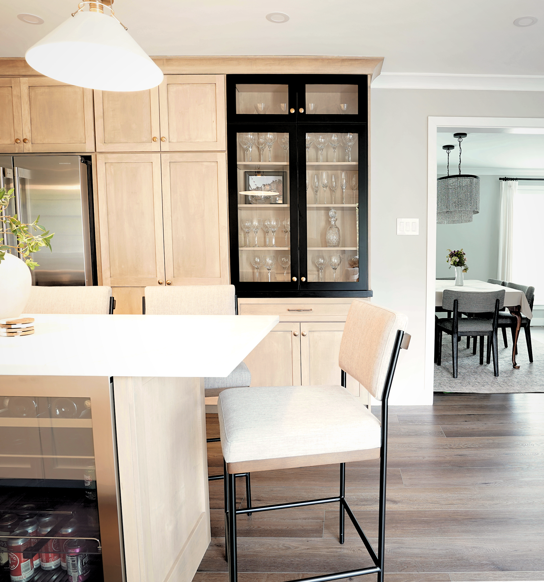
One of the more interesting moments in this project came later in the process. Once the layout was finalized and we were moving into implementation, my client mentioned he would love to have a double oven with French doors. It wasn’t a must-have—but it was something he kept coming back to. And this is where design decisions get real. To make that work properly, the oven needed clearance so the doors wouldn’t hit the adjacent wall. The obvious solution would have been to add a filler panel. Technically, that solves the problem. Visually, it doesn’t. A filler wide enough to make that work would have looked awkward and out of place within the cabinetry run. So instead of treating it as something to hide, I treated it as an opportunity.
That “filler” became vertical wine cubbies. Not the typical solution, but one that made sense here. It solved the clearance issue, kept the proportions balanced, and added a detail that felt intentional rather than added on. At first, my clients thought I was simply giving them a generous amount of wine storage which led to a lot of laughs, especially since they already have a full bar in the basement. But once I explained it, it clicked. It’s not wine storage. It was a design solution that just happens to look like one. And yes – every single person who walks into the space notices it.
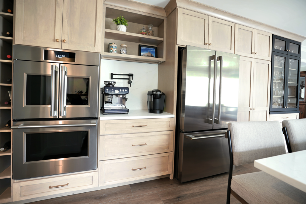
Small Decisions That Change Everyday Use
Not every impactful detail is dramatic. Some of them are just… practical. The coffee station was designed to be part of the overall flow, not an afterthought—a dedicated spot that makes mornings easier without interrupting the rest of the kitchen. And the pot filler, while often seen as a luxury, was really about convenience. In a kitchen designed for cooking, it removes unnecessary steps and supports how the space is actually used. These are the decisions that don’t always stand out in photos, but they’re the ones clients appreciate every single day.
Looking for ideas for your own kitchen renovation in West Chester or Chester County? Explore more projects in our interior design portfolio.