
Choosing the right paint color should feel exciting — not overwhelming. Over the years, I’ve seen a few mistakes pop up again and again — simple missteps that can throw off the entire feel of a room.
The good news? They’re easy to avoid once you know what to look for.
In this post, I’ll walk you through the top 5 mistakes I see all the time (and how you can dodge them like a pro). Whether you’re refreshing a room or starting from scratch, these tips will help you choose a color you actually love — and that loves your home right back.
Let’s dive in!
1. Ignoring the “Bossy” Finishes
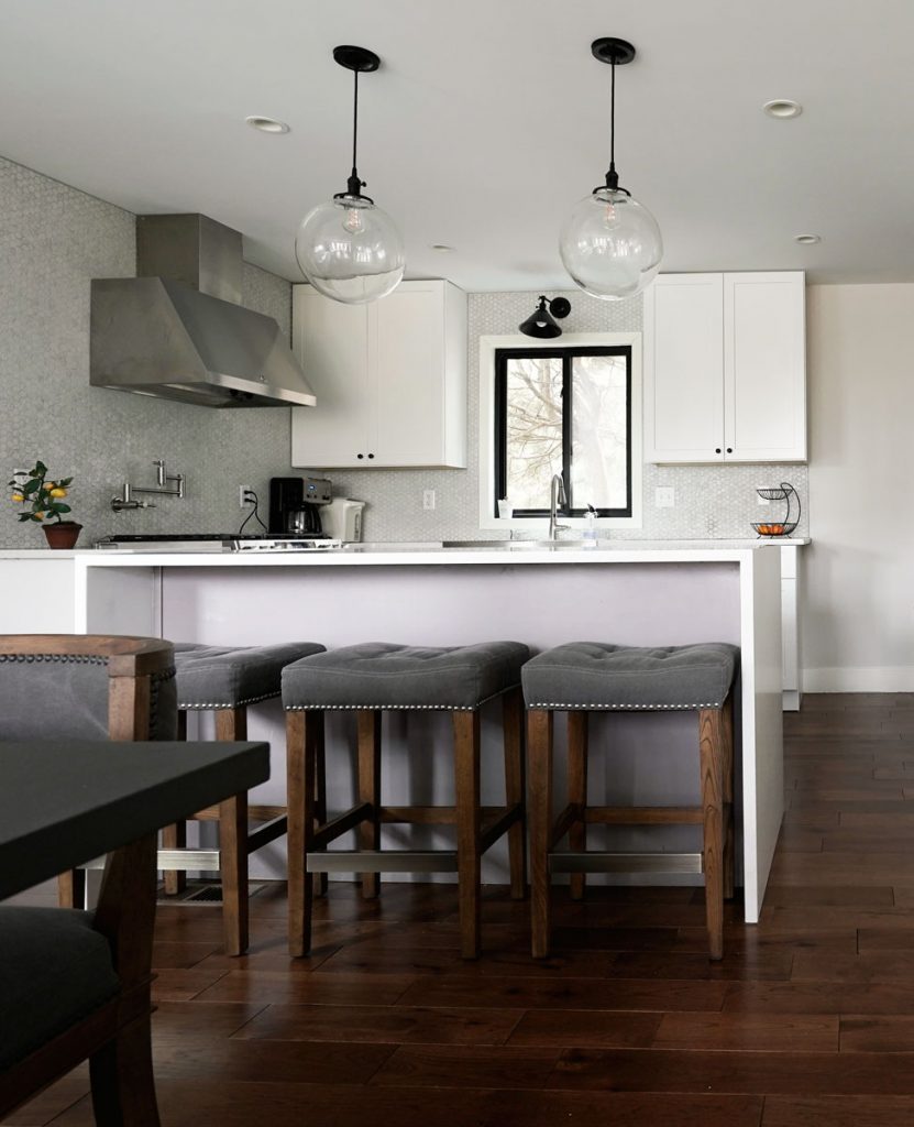
Your floors, countertops, tiles, and stone fireplaces? These are the “bossy” finishes, as I like to call them. If you are not ready to chage them, don’t ignore them when picking paint. You might end up with a trendy color that clashes hard. Always work with your finishes, not against them, to keep everything feeling cohesive and beautiful.
2. Falling in Love with a Tiny Swatch
Paint colors look waaay different once they cover an entire wall. That cute 2×2 sample can suddenly feel neon bright or way too dark. Always test a larger sample on the wall — and remember, vertical surface for walls, horizontal if it’s for floors! Light is reflected differently and trust me, how you look at the swatch can make all the difference.

3. Copying Someone Else’s Color Without Checking First
Just because your friend’s kitchen looks amazing in that pale blue doesn’t mean it’ll look the same in your house. Different lighting, finishes, and undertones change everything. Test it in your space, or risk major disappointment.
4. Skipping the White Border Trick
Testing the swatch against the sofa, countertop, fireplace — great! But when testing samples against the wall to get an idea how light will reflect, tape a sheet of white paper behind them! It frames the color and stops your existing wall color from messing with your eyes. It’s a small step that makes a huge difference — and yes, you’ll probably have an “ohhh I see now” moment. (Bonus points if you flap your arms excitedly like I do while explaining it. 😂)
5. Picking the Wrong Undertone
Every color has an undertone hiding under the surface. Beige can go pink, green, or yellow. Gray might secretly be blue, green or violet. And we are not even going to get into the grey-beige (AKA as greige or taupe) which can have all of the above. If you don’t spot the undertone early, it might clash with everything else in the room later. Always compare colors side-by-side to catch sneaky undertones before you commit!
Lighting plays a huge role in how an undertone “reads.” Even the most perfect neutral (and trust me, there’s no such thing) will look different in natural light, with overhead lighting, or lamps. So, test your swatch in the type of lighting you use most often — and test it in all the others to avoid unpleasant surprises.
Your color is also gonna look different in morning, noon, and night, different seasons (like when greenery is in full bloom and iready to lend a tad of green to your perfect creamy white).
Don’t just swatch and run — live with it a few days. Watch it in all kinds of lighting like it’s a soap opera, because that color will be changing its mood on you.
Bottom line is, neutrals can be the trickiest ones. In the images below, while the colors selected are all “grey”, you can see how gray can shift with different lighting and finishes.


Feeling a little paint-paralyzed? Don’t worry — I can help make picking colors fun (and painless)!
Check out my Design and Color Consultation page to get started — and let’s find a color you’ll love waking up to every day. 💛